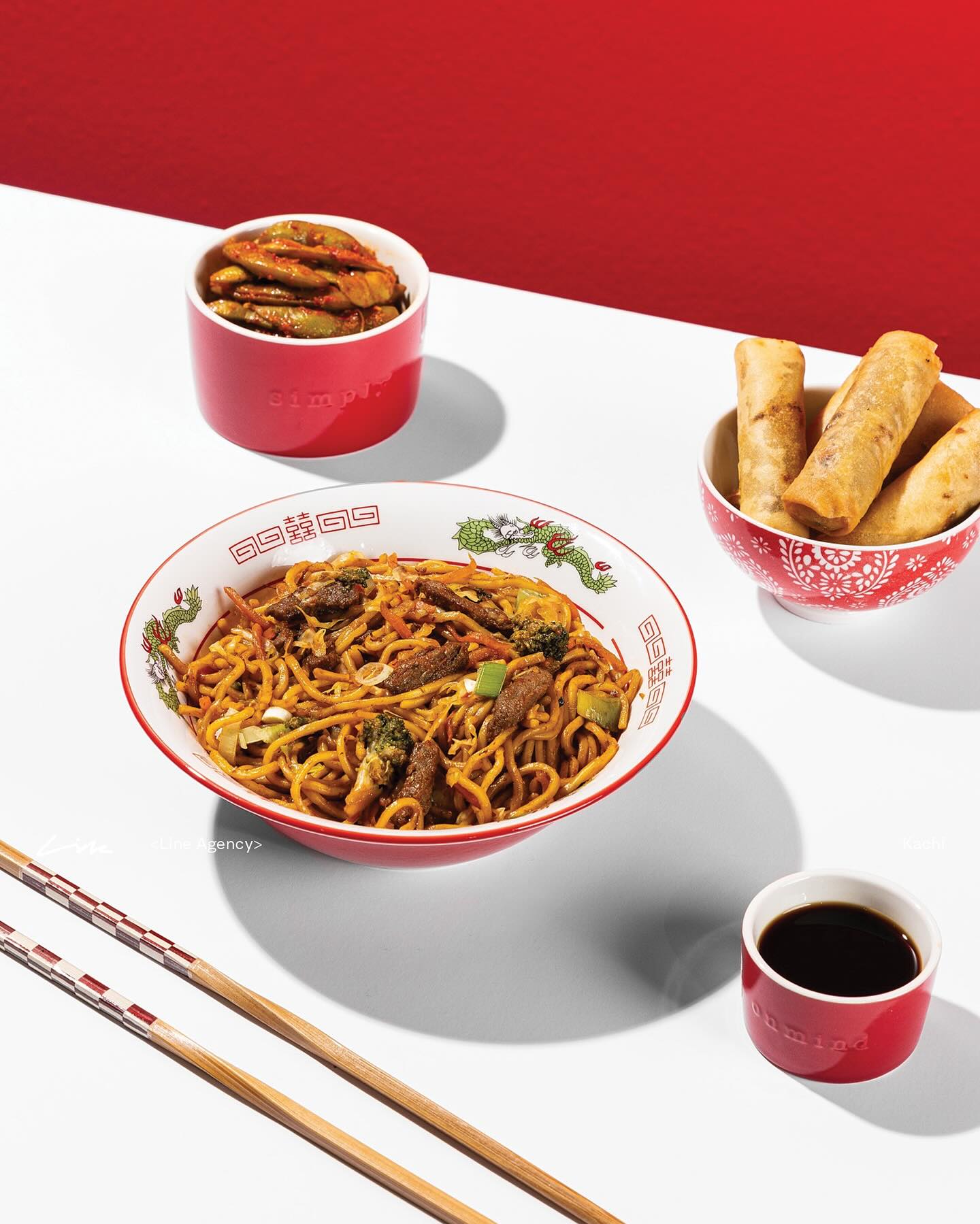
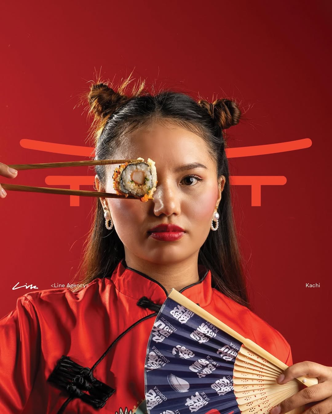
KACHI was conceived as an Asian street food brand bold flavors, fast pace, high energy.
But behind the scenes, the ambition went further. The food itself was developed by a five-star restaurant, raising the level of quality, technique, and expectation.
The challenge was to translate this contrast visually: Street food spirit without looking cheap, premium execution without looking formal.
Street food doesn’t mean low quality. And fine food doesn’t need to look restrained.
We identified that KACHI’s power lies in the tension between the two the raw energy of street culture paired with the precision of high-end cuisine. The branding needed to reflect both worlds at once.
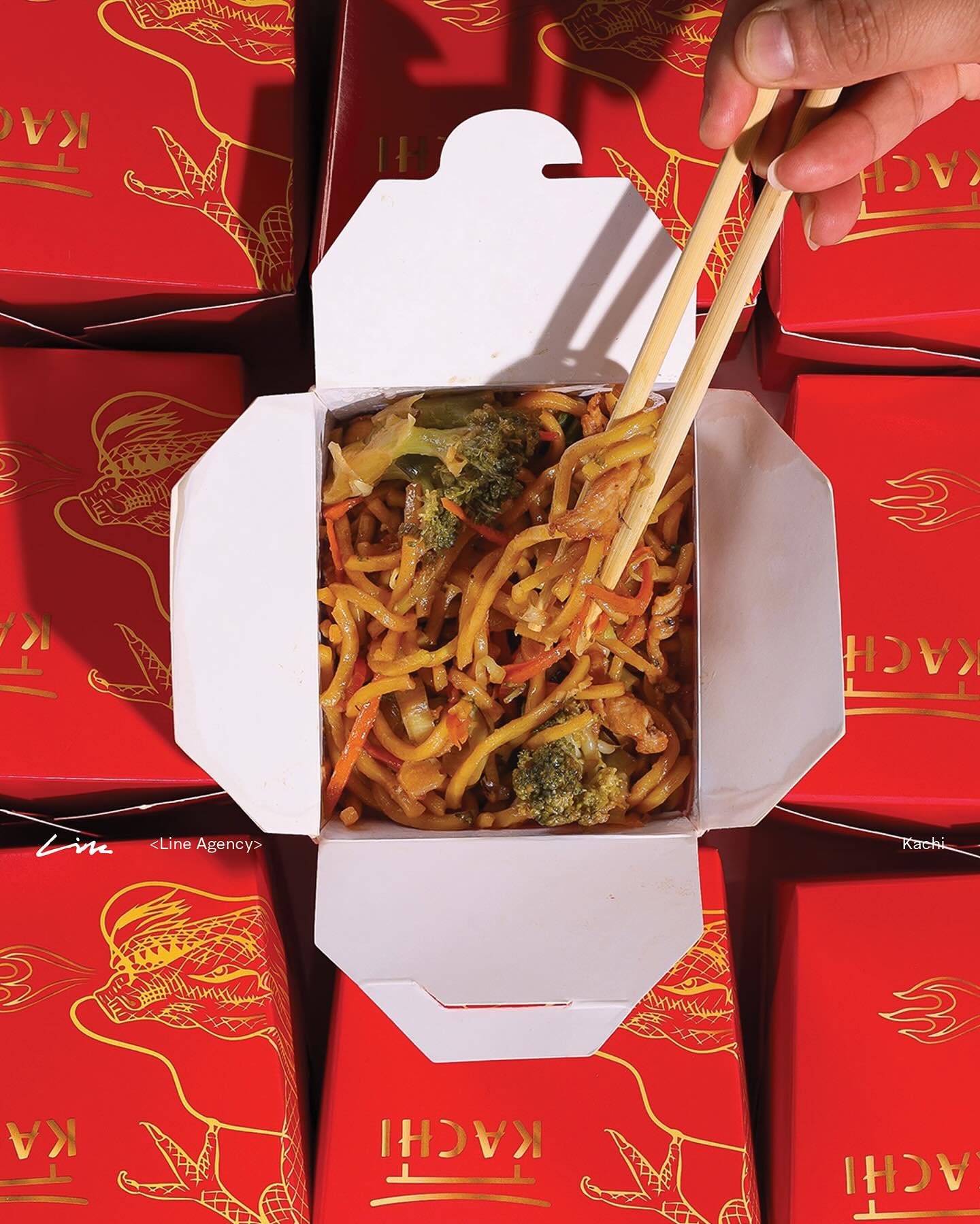
We designed KACHI from the outside in starting with packaging structure, not graphics.
Custom box shapes were developed to feel bold, graphic, and unconventional, immediately breaking away from standard takeaway formats.
On top of that, we created fully custom illustrations, inspired by Asian symbolism and street culture, designed exclusively for KACHI. Each drawing was detailed, expressive, and intentional reflecting craftsmanship rather than decoration.
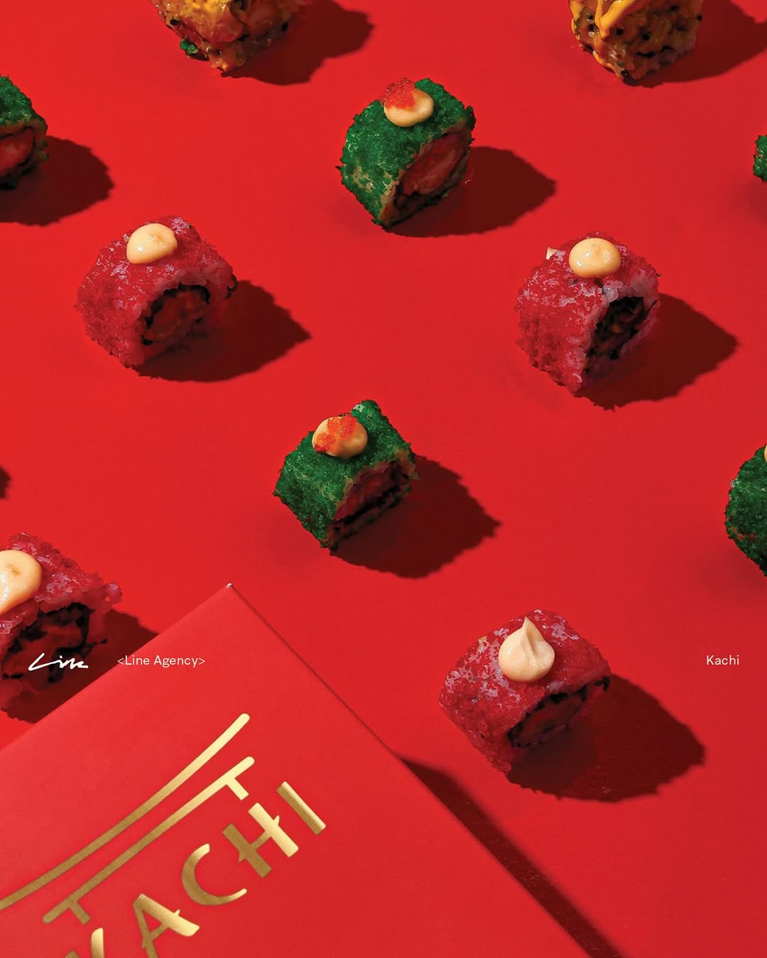
The color system was built around strong reds and sharp contrasts, amplifying appetite and energy while maintaining control and clarity mirroring the five-star level of the food inside.
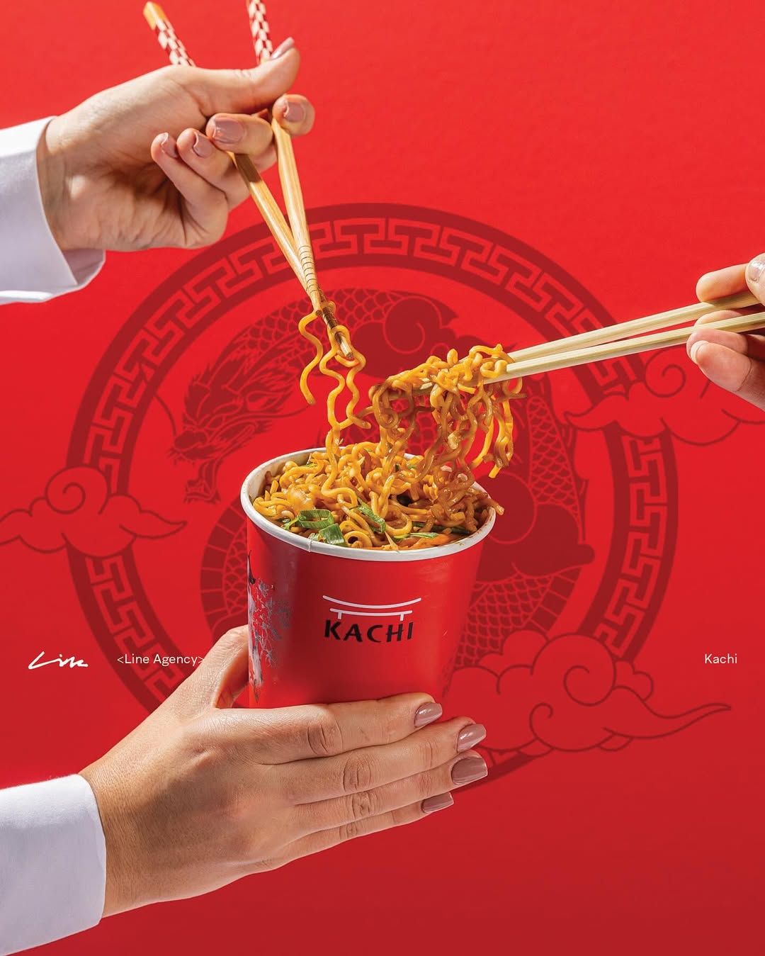
We delivered complete branding and packaging design, from logo creation to a full packaging ecosystem.
Every element, boxes, cups, and food containers, was designed to work as both a functional object and a brand statement. The result is packaging that feels street in attitude, yet premium in execution.